Projects Introduction
This introduction page introduces the reader to the following projects: Association Rule Mining on the transaction data and maps—interactive tableau story and plotly and shiny app deployed on the portfolio website. The projects are associate with individual modules that are taught through course 503. The primary programming language is python & R. More details on each project are broken down in the paragraphs below.
Mod4 Association Rule Mining & Maps
In the module 4 project, the main goal is to use association rule mining on the transaction dataset to extract critical combinations in the columns of individual words. The first step is to acquire raw data from Twitter using previously obtained API keys. The next step is to convert the raw tweets into columns of words called the vectorization process. Finally, word clouds and various visualizations are printed to assist in discovering essential correlations.
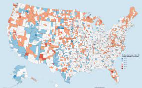
The mapping function provided by the package leaflet in R offers ample customization for building an interactive and exciting map. There are maps constructed in this project, with the main focus on the "Female_Percentage," "Water Area," and "Land Area." Click and drag enabled by the leaflet package makes it very easy for anyone to dive more into the map and learn as much as they can.


Mod5 Interactive Tableau Story
Tableau is a powerful interactive app that can be used to build an exciting story. The tableau story shared is looking to explain what type, shape, historically, and when UFOs have been observed. It also answers the question of whether Georgetown is a good location for UFO sightings.

Mod6: Plotly & Shiny App
In module 6, plotly and shiny are explored. The shiny app is built using R with the mtcars dataset, and plotly is graphs built using python and apple stock dataset. From using plotly and Shiny app, it is evident that plotly is more of a comprehensive data analysis tool while the shiny app is suitable for demonstrating interactive results with dynamic elements. The main goal is to understand various aspects of the apple stock dataset utilizing the plotly graphing capability, for example, candlestick chart and OHCL chart, which are especially handy for the stock dataset. All the visualizations are embedded on the mod5 webpage, which may slow down the loading speed.
